Formosa
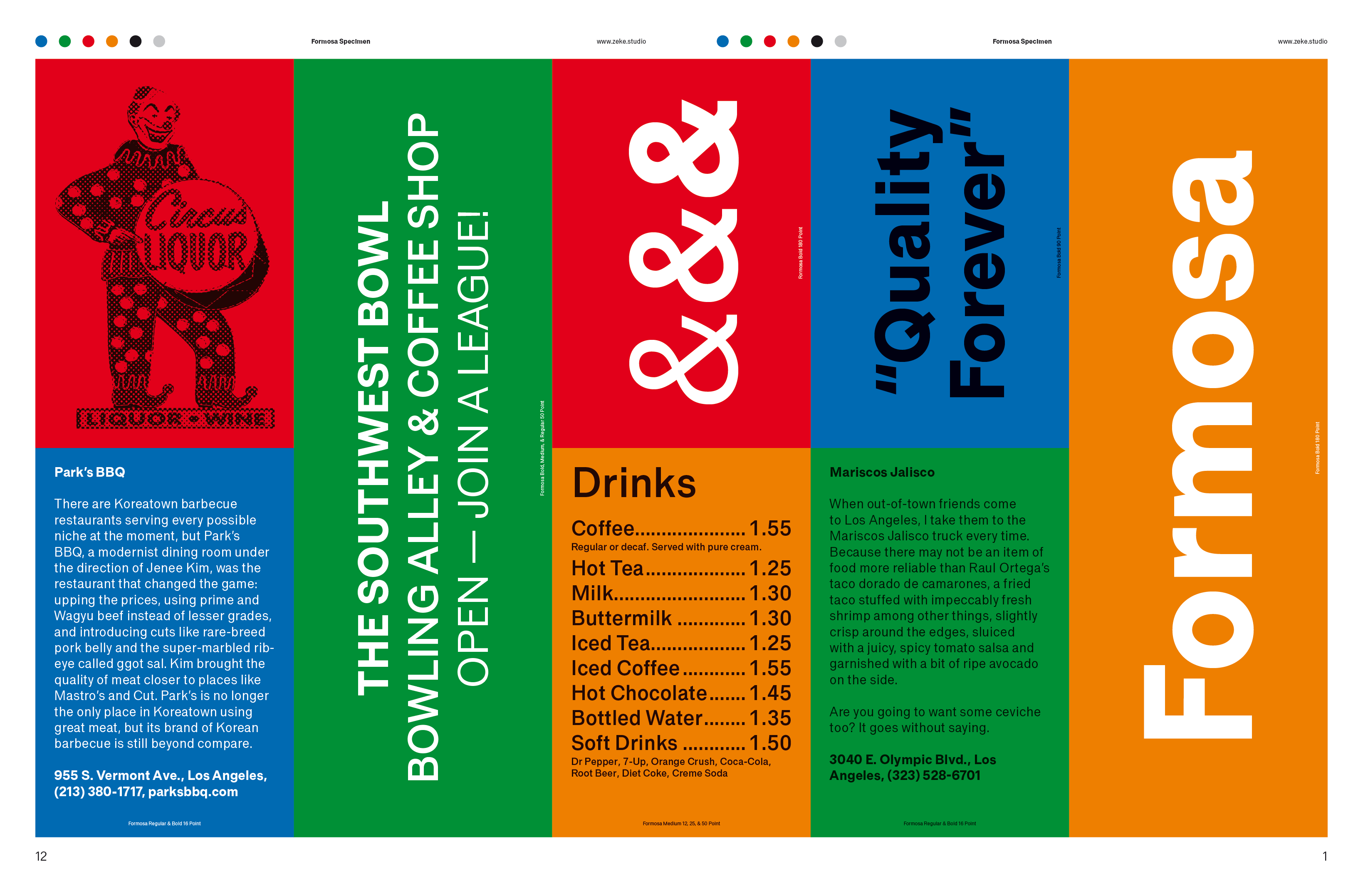
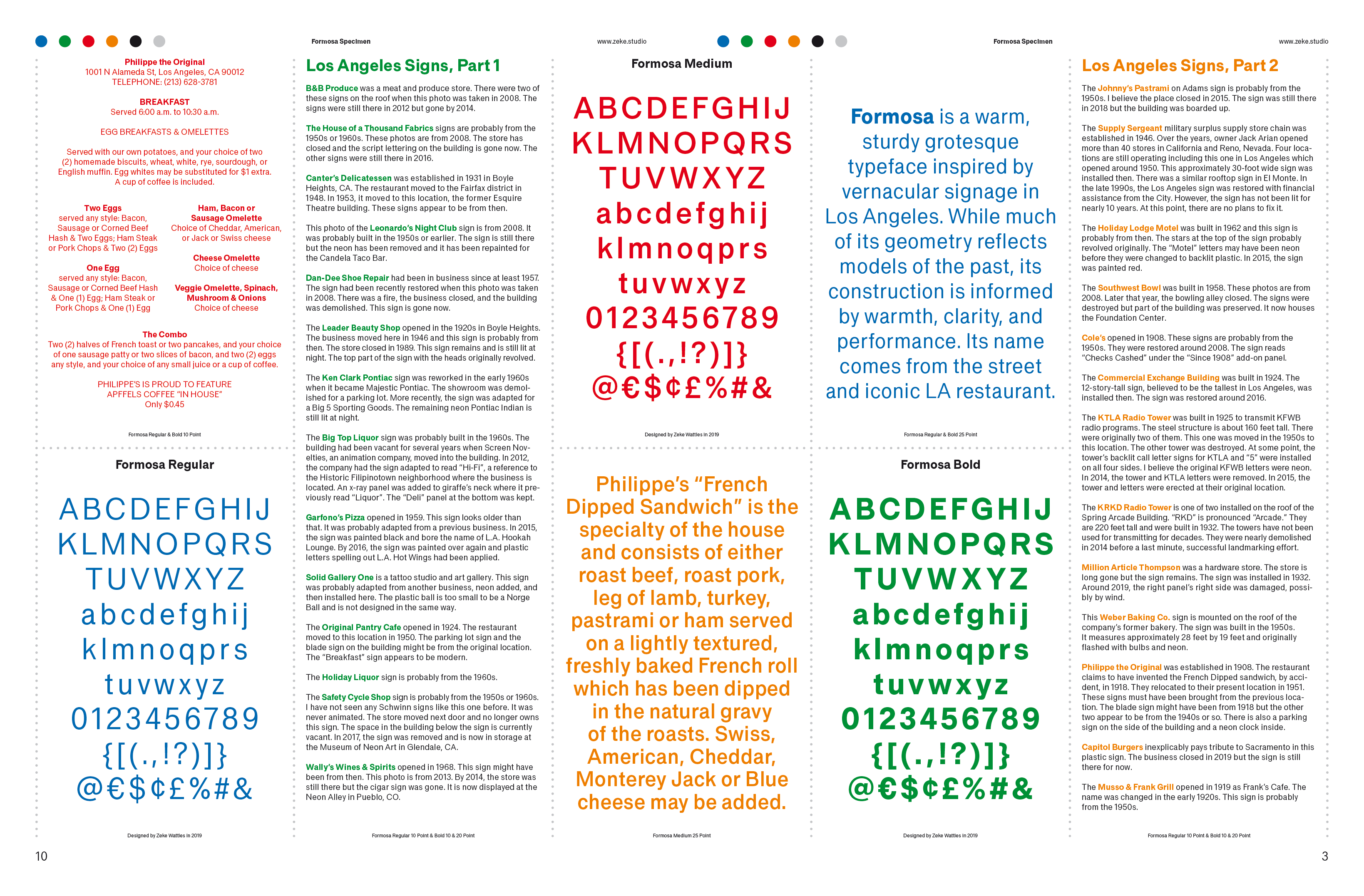
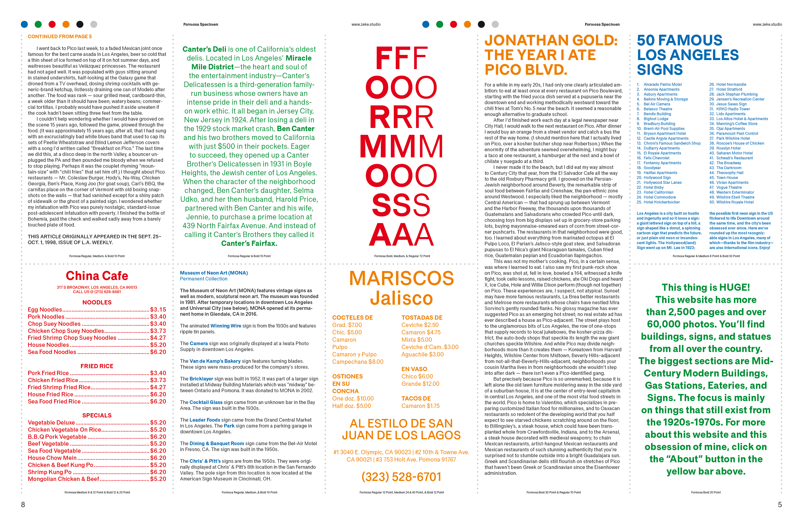
Formosa is a warm, sturdy grotesque typeface inspired by vernacular signage in Los Angeles. While much of its geometry reflects models of the past, its construction is informed by warmth, clarity, and performance. Its name comes from the street and iconic LA restaurant.
Category: Type design, type specimen
Instructor: Greg Lindy
Year: 2019
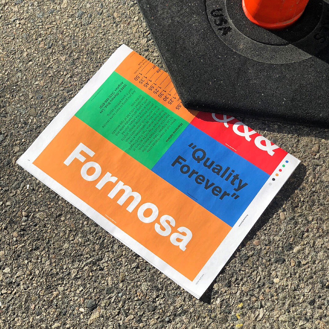
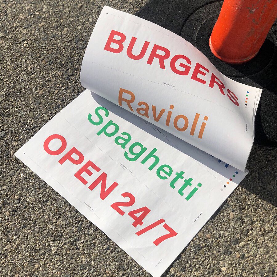
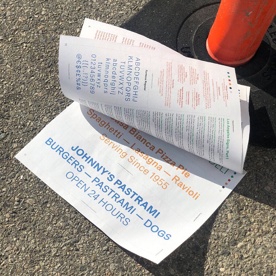
Newsprint Specimen
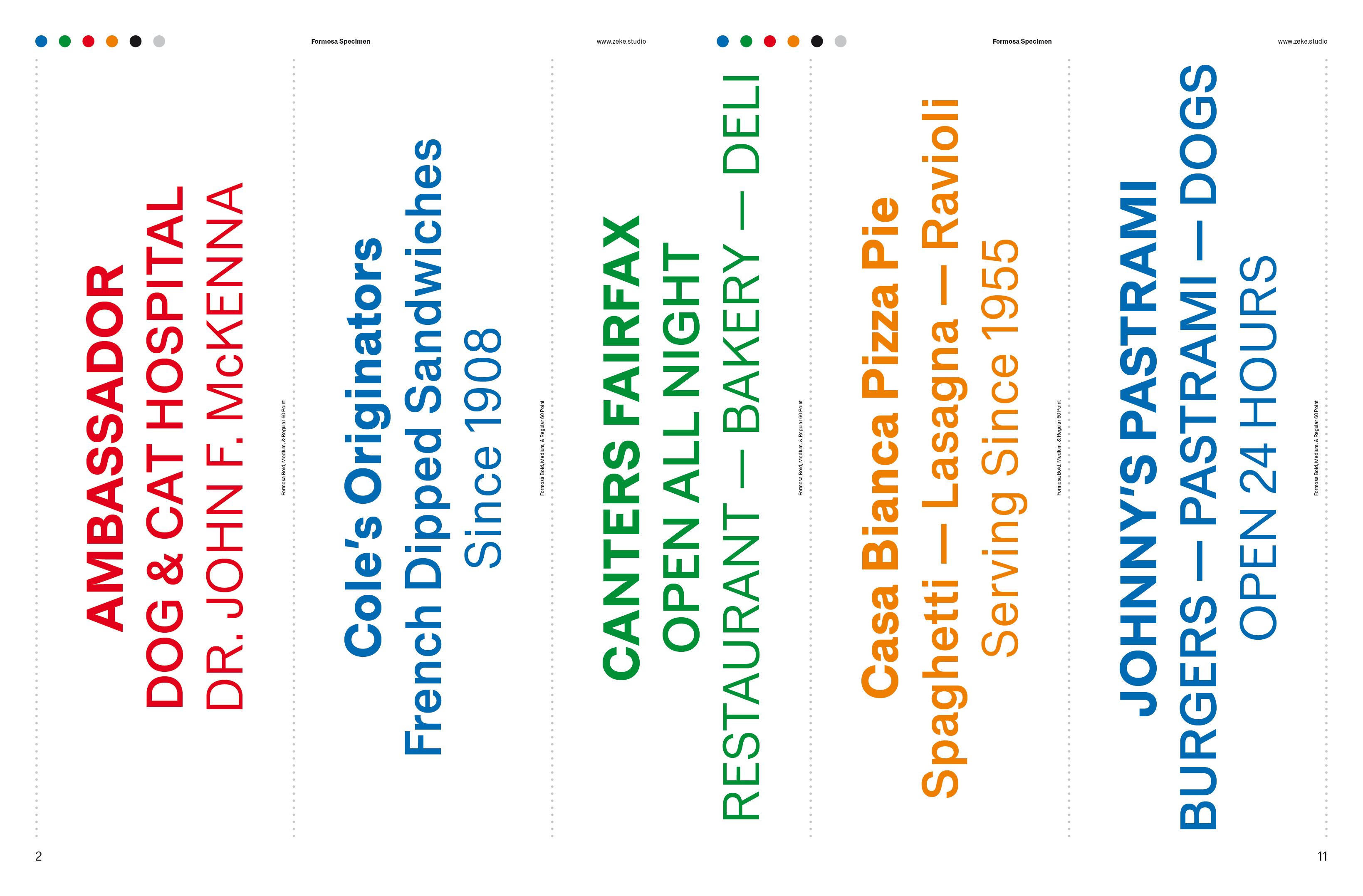
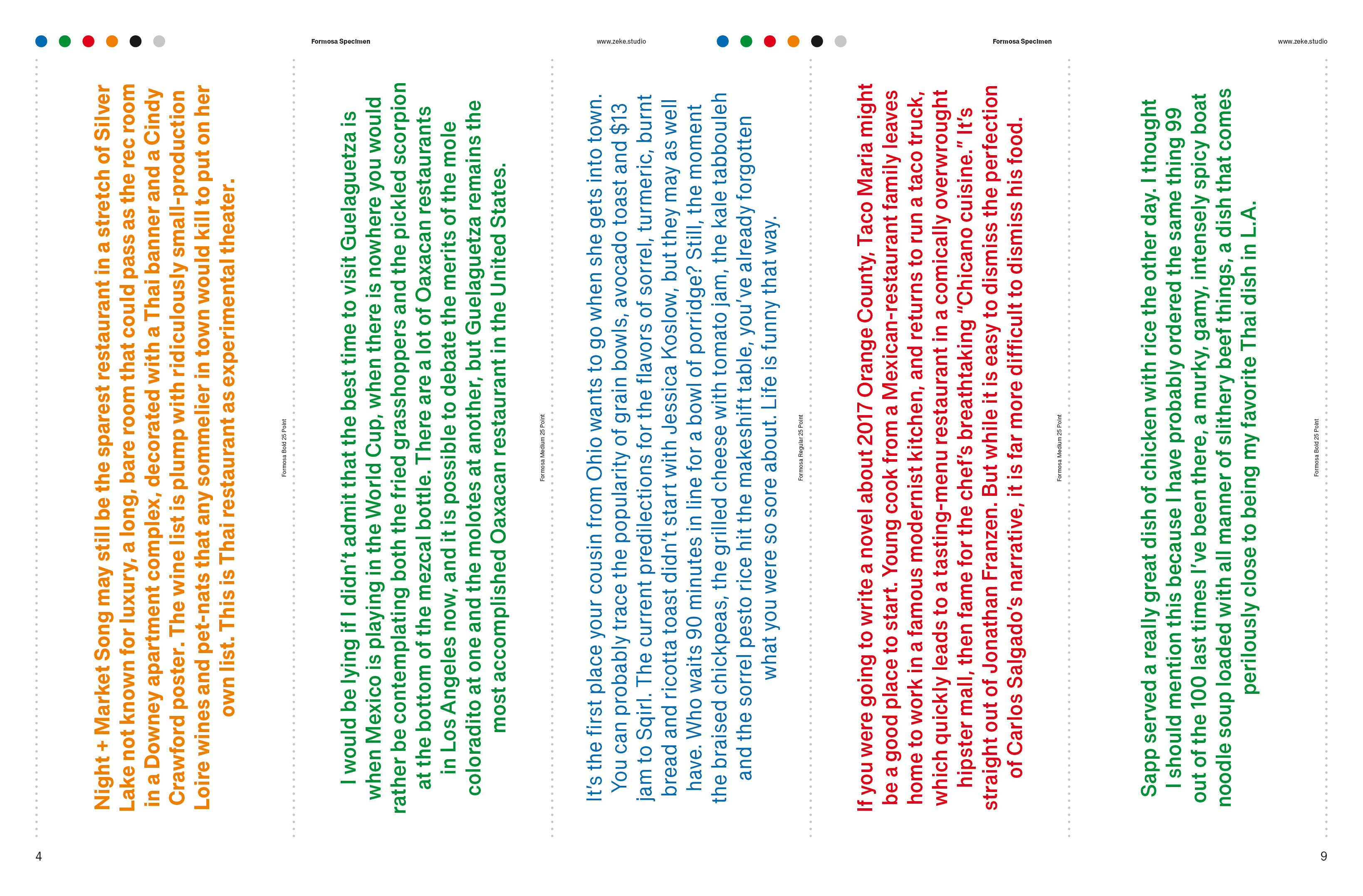
The copy is pulled from iconic LA signage, restaurant menus, and the late Jonathan Gold’s writing about his hometown. The specimen’s function is more mood than explanation.
Process
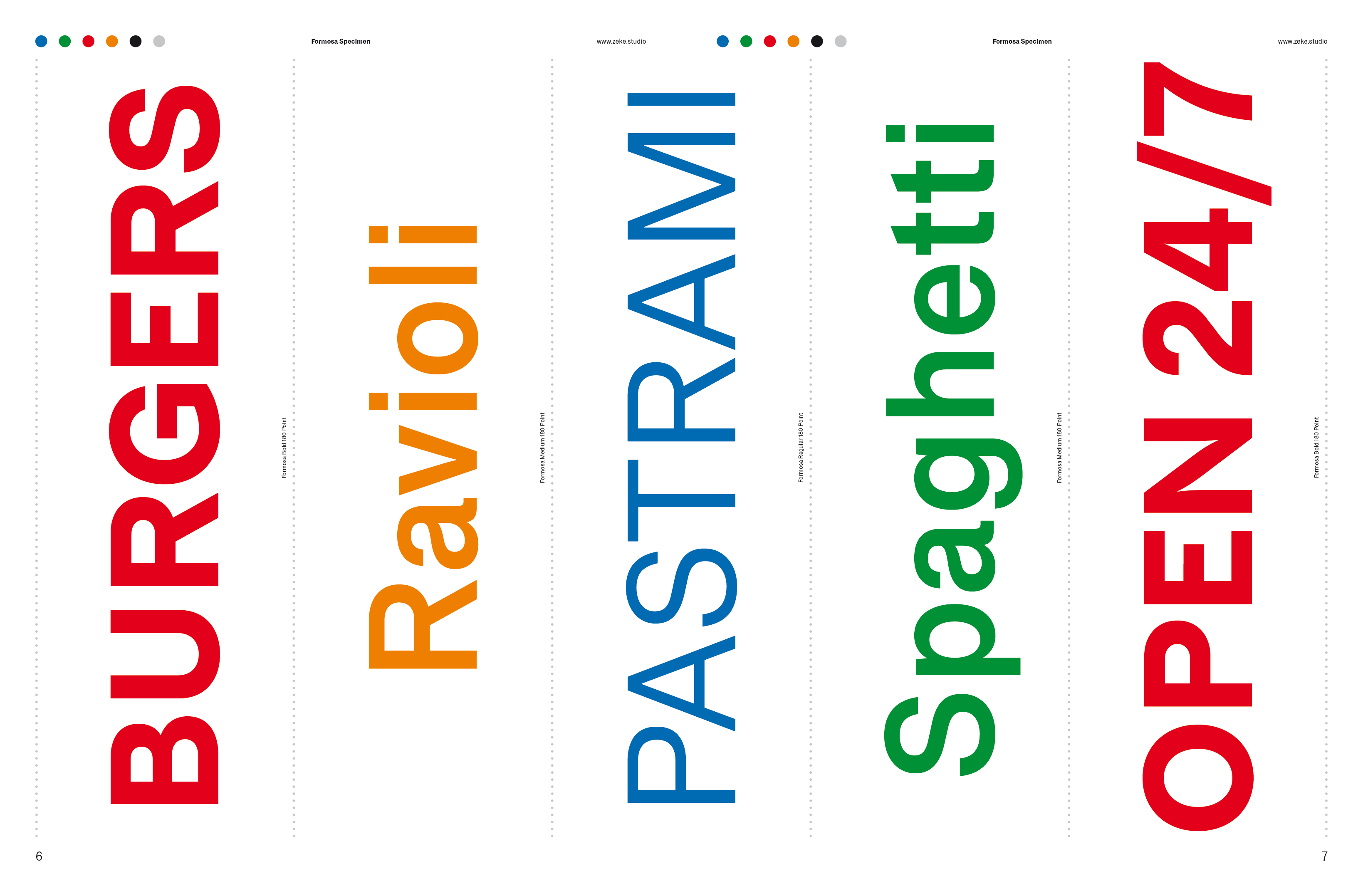
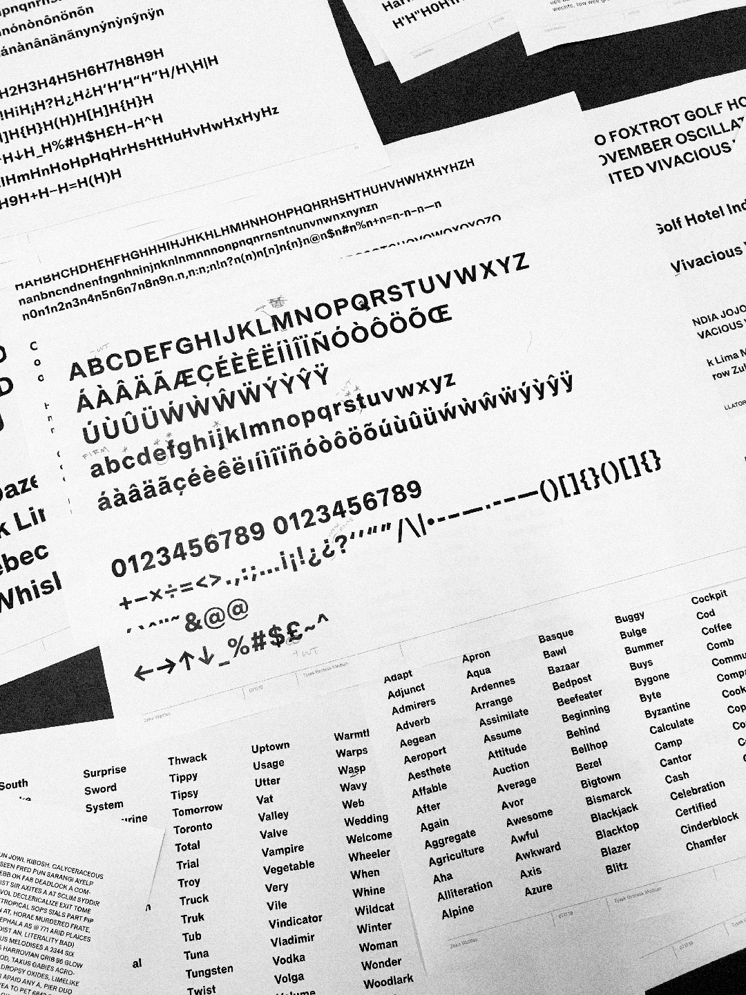
Type design is a long and meditative process with plenty of print-outs and red ink along the way. Regular print-outs and rigorous testing ensure that the typeface can function at a variety of sizes — both headlines and long copy — and every possible character combination is properly kerned.
Planned for release in 2020.
